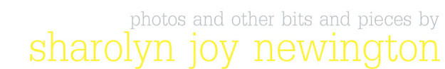
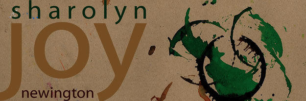
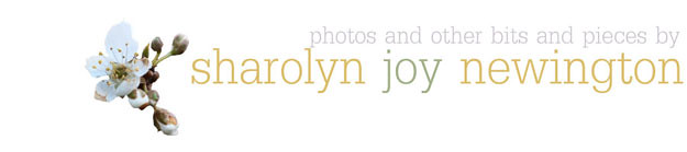
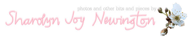
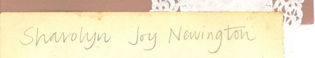
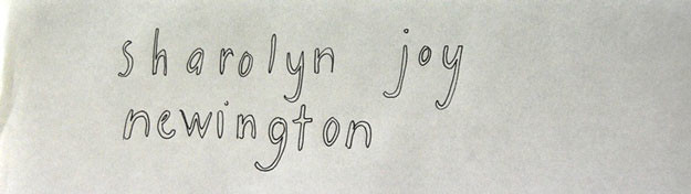
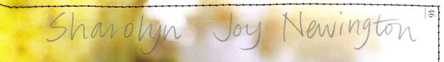
I think it is the simplicity of the white backgounds and simple text which I like. They don't draw attention away from photographs and drawings. I wonder whether I should change it from my name (which looks funny repeated over and over again), but I do love my name and it saves having to come up with a silly punny title. The following are some of my experiments which never made the cut. The first is my original from when I started the blog. I think this is certainly an example of simple is best and sometimes first draft is best!


I love this new one as well...i also really like the b&w hand written one...but i think the plain white background of your current banner is suitable and definitely helps to highlight the beautiful imagery.
ReplyDeleteI think I like the fourth one the best, although maybe that's cos I'm used to it? They're all really quite incredible and great in their own way.
ReplyDeleteHa ha, you might just be on to something there Ming.
ReplyDeleteAppreciate your thoughts too Rhya!